Those of us who are learning Japanese are spoiled today by the wealth of educational resources available. However, at some point a student has to look beyond all the textbooks, apps, and videos, and start getting exposure to real Japanese. After all, isn't that why you started studying in the first place? However, knowing where to look is a little more complicated. For many, this is one of the first roadblocks they come across. Finding material that is interesting enough that you want to interact with it, but simple enough to still be comprehensible is no easy feat! As my own Japanese has improved, I've started to read books, play games, watch videos, and interact with more native material. However, I was still looking for something to add to my study habits that offered a wide variety of different texts, but still used standard grammar and vocab.
This is where the Todai Easy Japanese app comes in. Similar to the NHK Web Easy website, Todai Easy Japanese is a website with an iPhone and Android app that aggregates Japanese news articles from a wide range of sources and over a number of different topics, and offers a comprehensive set of tools to help learners maximize what they've just read. In this piece, I'll be specifically referring to the Android app, as it's what I've used most, though this should be applicable to both versions of the app. The website itself is a bit more bare-bones.
In addition to the articles, Todai Easy Japanese has a powerful dictionary and grammar resource, tools to practice speaking and translation, JLPT practice exams, and fun videos to expand outside of just curated news articles. All of these combine to make a very comprehensive app for experiencing Japanese content, while still giving learners help when they get stuck; though the app is not without its rough edges.
- Overview
- The Article Reader
- Dictionary
- JLPT Study
- Videos
- Settings and Paid User Account
- The Bad
- Conclusion: An Excellent News Reader App with Bonus Features
Overview
The main draw of Todai Easy Japanese is of course the news articles. Unlike NHK Web Easy, Todai Easy Japanese pulls from a variety of different news organizations, including The Asahi Shimbun, CNN, BBC, and Chunichi Shimbun, among others. The app has five navigational pages on the bottom of the screen, for articles categorized by "easy" and "hard" difficulty levels, the built-in dictionary, a JLPT practice section, and a video player.
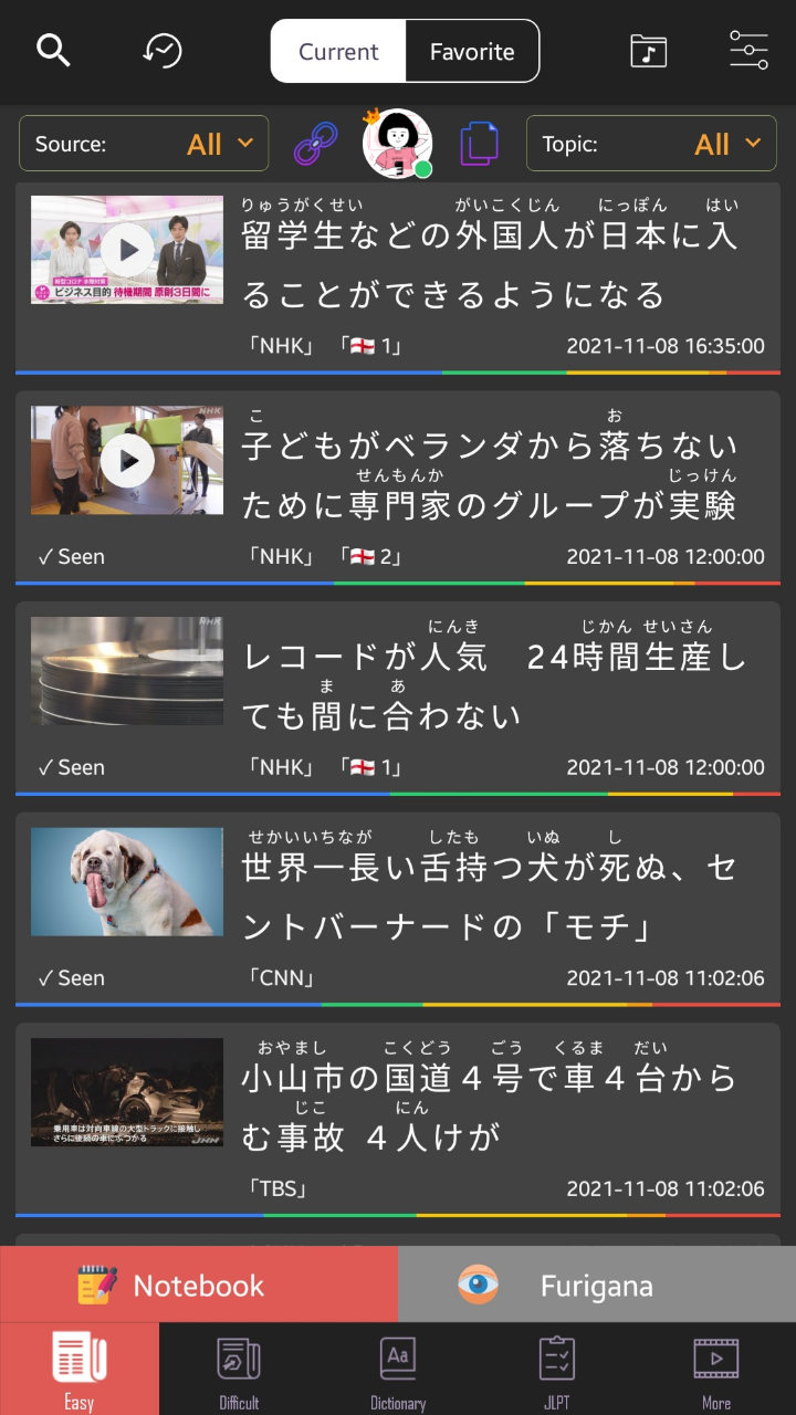
Articles in both the "easy" and "hard" tabs are shown in the same way. They display as cards, with the headline, the article's header image, the source of the article and date it was published, and a small icon to indicate whether or not someone has submitted a translation yet. Along the bottom row of the card is a bar with different colors. These colors indicate the difficulty of the words included, as determined by their JLPT level, displayed in a stacked bar chart. This gives learners a quick and more nuanced way to determine the difficulty of an article beyond the binary "easy" and "hard" categories. For example, blue corresponds to N5, green for N4, yellow for N3, orange for N2, and red for N1. So an article where the yellow bar is larger than the blue bar is going to have more complex vocabulary.
Just above the navigation bar, there is a button that takes you to a "notebook" page. Here, you can make a new "notebook" (like a folder) to sort some of the words you've come across into, for further study within the app in the flashcard tool. Next to the notebook button, there's also a button to toggle on and off furigana globally throughout the app, though there are options to fine-tune the app's furigana usage in the settings.
Along the top of the app, you can search for articles, view the history of articles you've read, toggle between showing all articles or only the ones you've favorited, view the list of audio you've saved from articles, or access the settings. Finally, just below that there are filters to show only articles on a specific topic or from a specific source, a button to access your user profile where you can view statistics about your app usage, and buttons to paste in either a link or Japanese text by itself for Todai Easy Japanese to parse using its tools.
The Article Reader
Given that reading articles is the primary function of Todai Easy Japanese, you would hope that a lot of thought has been put into the article reader, and it has! When you click on an article, you're taken into the full text. There's a row of different tools at the top of the page. These include a speaking practice section where you can record yourself reading the article, a page listing a dictionary entry for all the words used, a place to submit a translation for each sentence or view other users' translations, a button to add the article you're reading to your favorites, a button to view your article history, and finally one to access the settings.
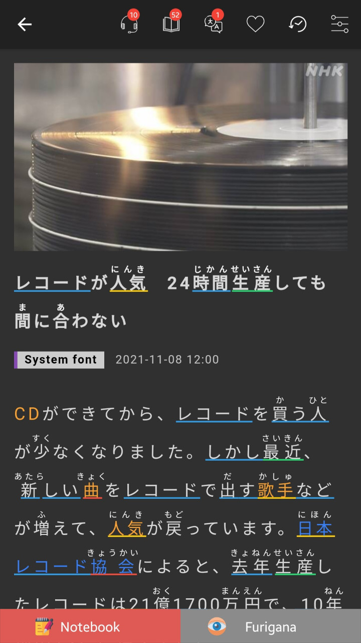
At the bottom of the page here, there's two buttons to access the notebook and toggle all furigana much like on the home page, as well as an audio player that generates audio for the article. Finally, just below the headline there's a button to toggle between using the system default font, or Yu Kyokasho, a common Japanese font used in textbooks. I'll talk about these tools in more detail later.
In the article itself, you're shown the same header image or video as on the small card, and just below that is the headline. You'll notice right away that both the headline and the body of the article utilize the JLPT highlighting that's shown on the card, putting a small underline under words in the color corresponding to their JLPT level. In addition, certain words are written in orange. These words are the vocabulary words for a given article, and listed beneath the body of the article and defined using a basic Japanese to Japanese dictionary entry.
Beyond these predefined words, any word or phrase in the article can be highlighted, and a small window will pop up defining what was selected in either a Japanese to English or Japanese to Japanese dictionary, depending on what you picked in the settings (though either is selectable in this window). These dictionary entries come from Mazii dictionary, which is made by the same company that makes Todai Easy Japanese. Finally, underneath the pre-selected vocabulary is a list of different grammar points used in the article, with little icons to indicate which JLPT level they correspond to.
Otherwise, things mostly work here as you would expect. If you press play at the bottom, a machine-generated voice will read the article, a feature I was pleasantly surprised with. If you become completely stumped on a sentence, highlighting it in its entirety will provide a translation again through Mazii. The app allows you to make lists of all the unfamiliar words you come across, and has a flashcard component to help drill their meaning and reading into your mind. I appreciated the easy copy feature to let me make my own lists outside of the app, where I log all new words I come across regardless of source.
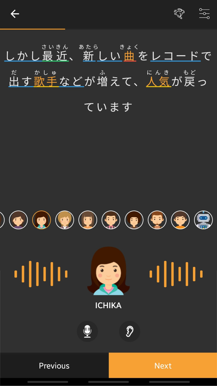
One feature I was really impressed with here is the aforementioned audio player. Using the playhead at the bottom, the app will generate audio for any article, with a wide selection of available voices to choose from. This works surprisingly well. Of course, I wish this were actual recorded native audio, but it would be difficult and expensive to create real audio for every article.
One of the buttons at the top of the page while viewing an article takes you to a speaking section. Here, the article is broken down sentence by sentence, giving you generated audio for each line, and then the ability to record yourself and then play back those recordings to hear your own pronunciation. I've found recording myself speaking to be a hugely valuable practice in improving my own pronunciation of Japanese, and ended up spending a lot of time using this tool for any article I read.
Similarly, there's a translation section that allows you to try and interpret each sentence into your native language, and check it against a machine translation. I found this most useful as a way to verify my understanding of a sentence more so than serious practice, but I used it from time to time nonetheless.
Dictionary
Next is the dictionary function. Like I mentioned earlier, when you highlight a word or phrase, you're given a dictionary entry in either Japanese to English or Japanese to Japanese, depending on what option you choose to default to in the settings. And since the company makes its own dictionary, these entries are really high quality. As someone who still uses a Japanese to English dictionary most of the time, I found the Japanese to Japanese dictionary to be very easy to understand, and quickly switched over to that option as another way to practice.
As you might expect, you're not just limited to looking up words from the articles, but using the dictionary tab, you can look up any word. This works very much the same as most other dictionary apps, with a few stand out features. For one, the handwriting input works really well. I've always struggled to get good results from the Jisho.org handwriting input, but using the built-in dictionary in Todai Easy Japanese, I had no trouble finding each kanji I drew.
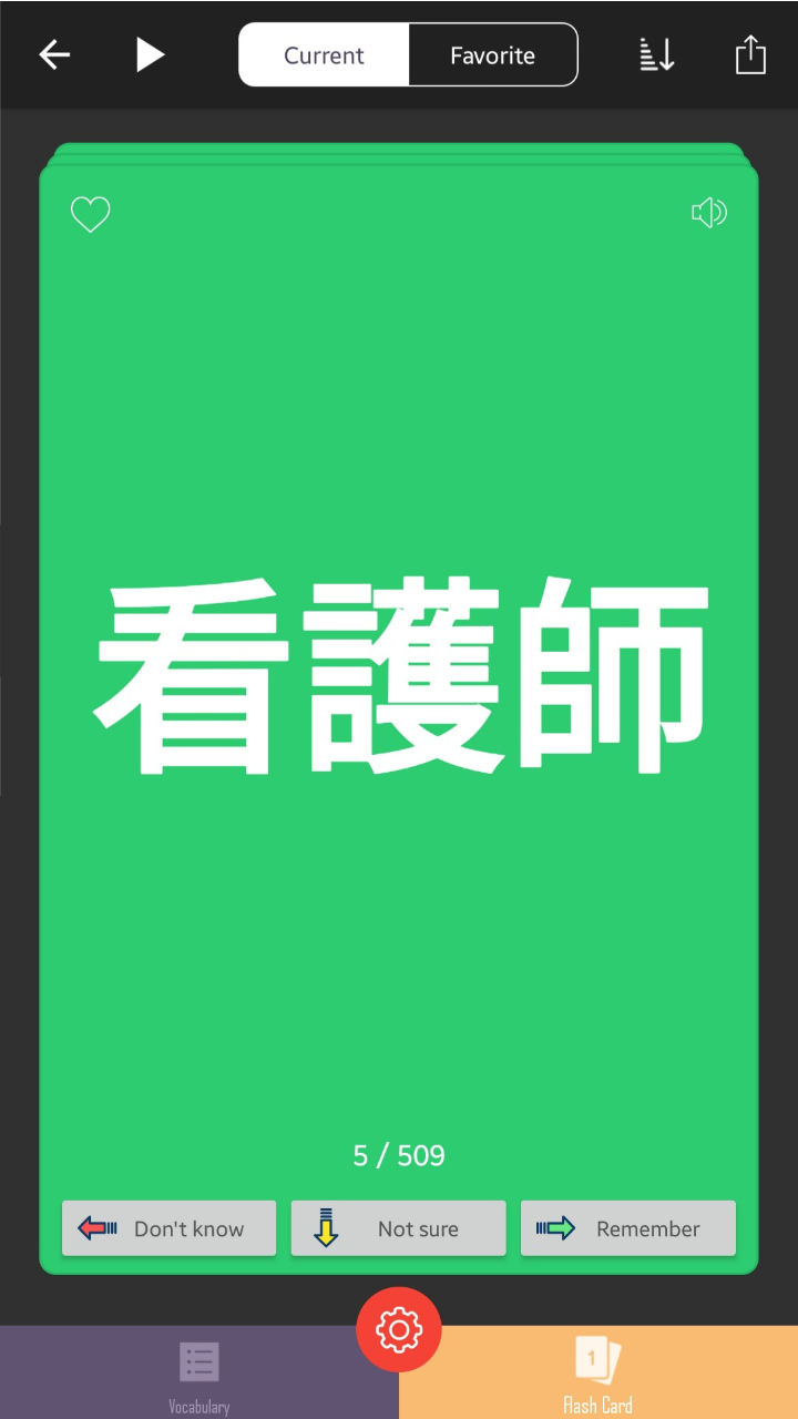
Finally, there's a built-in flashcard tool that generates flashcards from the words you've saved into a notebook. These flashcards will be very familiar to anyone who's used Anki before. On one side, they show the character you've saved, and with a tap, you can flip to show the definition. After you review the card, you can press one of three buttons to rate how well you remembered, which helps sort when to review them again. Of course, this is nowhere near as flexible or extensible as Anki, but it's a nice option for those who want to keep things in one place, or to review only a handful of words specific to articles in a casual way.
Finally, there's an image search option. This is a bit unusual, and not something I've seen in other dictionary apps. In practice, the results are a bit scattershot. Searching 傘 will get you pictures of umbrellas, but searching something more abstract like the expression 日に日に (which means "day by day") will mostly return pictures of text that include the phrase or simply the kanji 日. In the past, I have occasionally used image search to help learn the difference between two similar words (like 鐘 and 鈴 — both of which get often translated as "bell," for example) and I'm sure you could use this in a similar way.
JLPT Study
I wish there was better integration with the rest of the app, perhaps letting you know when you've come across grammar structures or words from a specific level a number of times, or keeping track of the content you've read.
The next tab over is a JLPT study section. All five JLPT levels are listed, from N5 to N1, with a number of different tests in each category. These tests are timed, and very similar to other JLPT practice exams, with sections matching those on the test. Once you're finished, you can press a submit button and get instantly graded.
Additionally, at the bottom of this page, there are buttons that take you to lists displaying numbers for the different words covered by each JLPT lesson. Here too you can click to be taken to a dictionary entry for the word, or log it to a notebook or your favorites lists for further study. It would be cool if these lists counted down as you learned words through the flashcard component, but as far as I can tell, they stay the same, with words getting a green circle next to them on the list once you've learned them.
Overall, this section is useful, but a little out of place. I wish there was better integration with the rest of the app, perhaps letting you know when you've come across grammar structures or words from a specific level a number of times, or keeping track of the content you've read. I don't personally want to sit down and take a practice test for upwards of two hours on my phone, and found only limited usage in looking over the lists of words from each level. But perhaps if someone wanted to focus most of their study in Todai Easy Japanese, this and the flashcard study would help facilitate that.
Videos
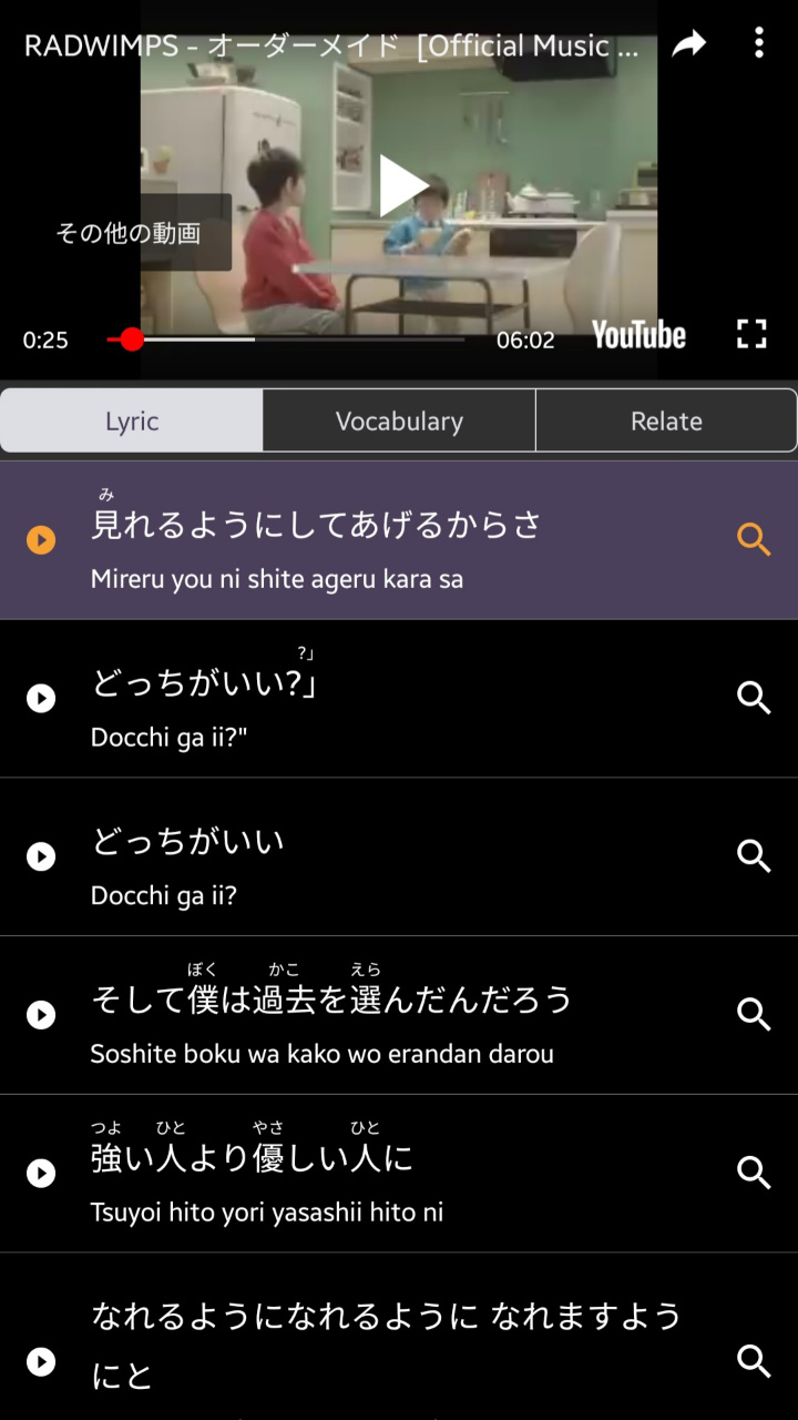
The final tab is a video player. Here, the app curates a number of videos, primarily music videos, but some fluff viral-esque videos as well. When you click on a video, you're taken to a page with an embedded YouTube video, and the bottom of the page becomes a karaoke-style scroll, highlighting the lyrics or transcript as they're said. Again, this is a bit random for a news-focused app, but I actually enjoyed this section more than I expected to. Music can be a difficult but rewarding component to study in another language, and having the lyrics broken down into phrases can make it easier to parse what's said, especially since music tends to use non sequiturs or unconventional speech.
Clicking one of the lines will jump to the part of the video where it's said, and there's a small magnifying glass icon which will automatically search for the line in the dictionary section. This is great if you're having trouble figuring out what something means, or want to review a line further.
It's a little unexpected, but a welcome addition, as I found it helped show me another way where my skills carried over, allowing me to understand much more of songs and various videos than I would have expected. It's much easier for me to understand Japanese in writing rather than spoken right now, but having the transcript available helped me parse some otherwise tricky lines in real, popular songs that I was listening to anyways.
Settings and Paid User Account
Beyond all the tools available, I really appreciate the level of control offered over how the various tools are applied in the settings. Most of all, I like being able to disable furigana and underlining for words under N3, the level of content I'm studying primarily now. This helped me really hone in on the level I wanted to focus on, and avoid "cheating" on the readings of words I should already know.
I like having a profile where I can see how much time I've spent using the app, how many consecutive days I've used it for, and other similar data.
There's a few other settings of note, allowing you to toggle between light and dark mode, configure the way text displays with font size and spacing, and the default voice for the generated audio (there really are a lot of them!).
Important to note is that the app is technically free with ads, and has a paid tier ranging from $2.99 to $25.99 depending on the length of your subscription that removes ads and gives a few bonus features like the ability to read articles and use the dictionary offline, and to sync between different versions of the application. I opted to go for a membership, as I didn't want to be distracted by ads, but I think I probably could have gotten as much value out of the app even without paying.
I'm also someone who responds well to gamification and data tracking, so I like having a profile where I can see how much time I've spent using the app, how many consecutive days I've used it for, and other similar data. These profiles aren't limited to the paid version of the app, but if this data is important to you, you might want to be able to sync it across devices through the paid app.
The Bad
Of course, with all of the good comes some bad, and Todai Easy Japanese is not perfect. Mostly, it's just a little rough around the edges. In design and usage, it's not very sleek or cohesive in the way we've come to expect with modern applications. It's clear it's not made by an English-native company, as there are strange translations here and there, like with one of the categories of article you can filter by listed as "Anatomize" (clicking on this filter doesn't exactly make it clear what it's trying to convey, either).
The JLPT and video tools have their upsides, but feel more tacked on than cohesively integrated into the rest of the experience. Clicking a button may take you to another section of the app entirely, like with the flashcard viewer which is a little opaque to locate. It can be difficult to tell "where" you are in the app. Overall, it just feels like it's trying to do too much, rather than just focus on the admittedly excellent news reader.
Conclusion: An Excellent News Reader App with Bonus Features
There's also a wealth of different topics covered, so there's always something to keep you reading.
Overall, Todai Easy Japanese is a really comprehensive app for finding material to immerse yourself in the Japanese language with. The content is simple enough that most upper-beginner or intermediate learners will be able to comprehend what they're reading, while still being complex enough to remain engaging. Honestly, I heard about a few news stories through Todai Easy Japanese first, especially events or happenings in various Japanese prefectures that didn't get international coverage. There's also a wealth of different topics covered, so there's always something to keep you reading. I'm a big fan of baseball, and it was cool to be able to see how the Japanese press covered Ohtani Shohei's historic year, in native reporting, beyond just what was being written about him in America.
As an app, it is a bit hit-or-miss, filled to the brim with features you may or may not use, and a little untidy overall. But I rarely felt like the tools I didn't want to use got in my way. It would be easy to critique the excess if the main function was neglected, but that's not the case here. The article reader is responsive and truly useful; the rest to me was just a bonus. With the videos and music, Todai Easy Japanese can become one of your primary sources for native Japanese content during a specific stage in your study journey.
Ian’s Review
Todai Easy Japanese News is an excellent resource for Japanese learners looking for some new native material to study from. The tools offered are both helpful and fun, making the app something you want to use, though at times the experience feels a bit rough around the edges.
