I think it’s easy to forget that world exploration didn’t really start until fairly recently. The 1400’s was only 600 years ago, and in that short time we’ve mapped just about everything (that’s not underwater, at least). Even then, I’d say it took until the 1600’s for maps to start looking kind of like what the world looks like, and then another hundred or two hundred years after that for maps to look good. Heck, we just got Mapquest like ten years ago (though everyone knows Google Maps is the best, true that double true).
All that being said, that’s only “Western” people we’re talking about. Japan was pretty xenophobic until the 1800’s, and they didn’t “get out” much. You could say that about all the Asian countries hanging about back then. It wasn’t until the 1600’s that Japan “saw the world for the first time” (in map form)… and boy did it look beautiful.
Matteo Ricci: Missionary and Map Maker
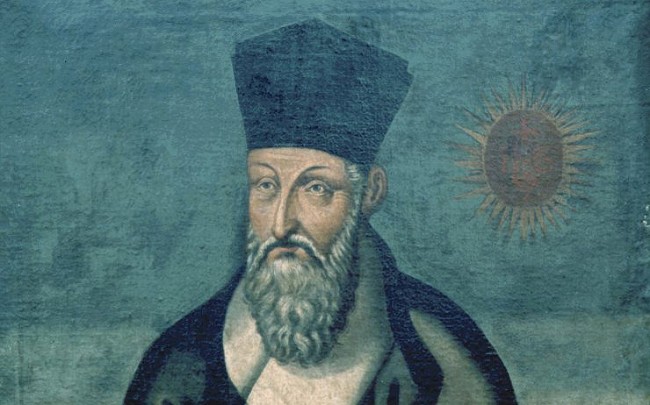
Forgive me for taking us to China for a bit. This isn’t a blog about China, but this is where the story starts.
Matteo Ricci (pictured above) was born in Italy in 1552. He wanted to become a missionary in India, but instead was dispatched to China where he arrived in 1582. He was in a Portuguese trading post (Macau), where none of the other Missionaries (or anyone, really) had to learn any Chinese. Because he was forward thinking, or bored, or something inbetween, he became one of the first Westerners to be able to read Chinese script. He and another guy, Ruggieri (one of the only other Missionaries who studied Chinese) then went around mainland China to do their missionary duties.
Apparently, he was already pretty skilled at map making, and was invited to stay in Zhaoqing (an area of China), where in 1584 he Ricci composed the first European-style map in Chinese. The original map does not survive, but there are many copies, some of which eventually made it to Japan (and are there to this day).
The Kunyu Wanguo Quantu
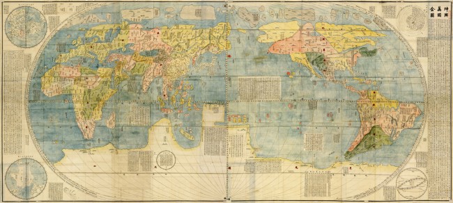
Click the map for a bigger version, or click here for huge version
The Kunyu Wanguo Quantu 坤輿萬國全圖, which means “A Map of the Myriad Countries of the World” was originally created in 1584 (by Ricci, of course), and had other editions created after. The above image is the third revision (created in 1602). This map is very large (1.5m by 3.66m), and of course shows China/Asia as the center of the world (European maps of the time normally showed Europe as being in the center). Overall, this map was pretty good, I’d say.
It made its way to Japan eventually, though it never really took hold like it did in China (at least not right away). Japan had its own World maps, though, and a lot of the information was said to have come from Ricci’s maps.
The First Japanese Map Of The World
Although the Kunyu Wnguo Quantu was making its rounds, it was largely a Chinese thing, and didn’t become incredibly popular until it was copied later on by Nagakubo (keep reading). One of the first Japanese world maps in Japan was actually a Buddhist map, which means all kinds of interesting things. Before we look at that, though, let’s take a look at Japanese Buddhist “World” Maps before they started incorporating the other countries of the world. These maps, called nansenbusho, consisted of only three countries: China, India, and Japan.
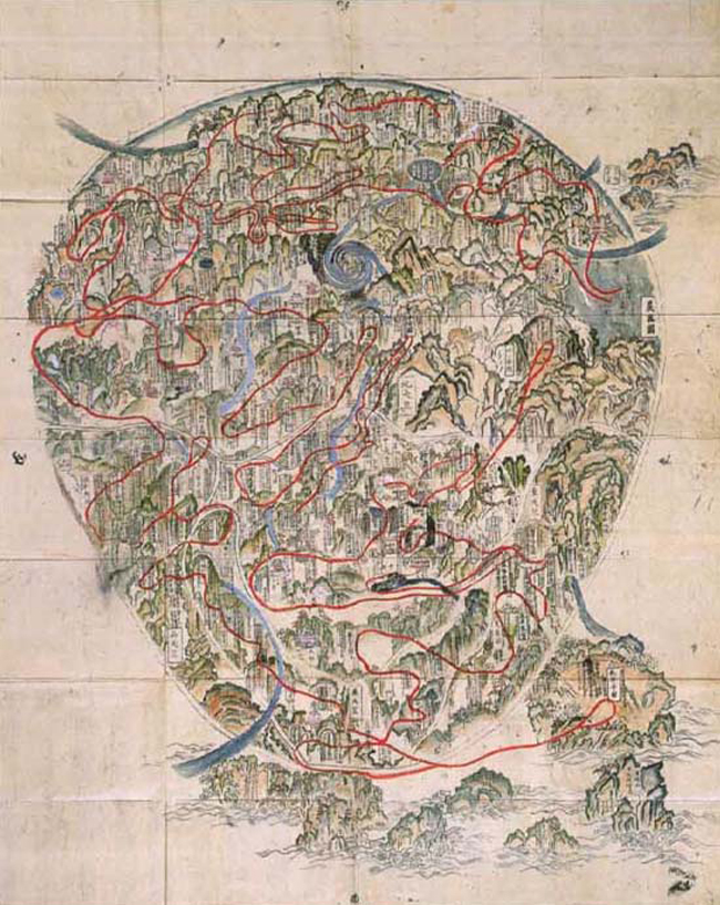
I wouldn’t say this map would be particularly useful for someone trying to find any of these countries, but China is in the Northeastern section, India makes up the inverted triangle shape at the bottom, and Japan is an island off to the East. These maps centered on the Buddhist world, and have a lot of Buddhist landmarks. The whirlpool in the middle, for example, is the center of the universe, which is a lake where Queen Maya gave birth to the Buddha.
This new map, printed in 1710 (considerably after Ricci’s map) is the first nansenbushu that contained the rest of the world. It’s thought that Ricci’s map had made some circulation by this time, and the author of this map heard about the rest of the world enough to make some fun guesses. Then again, the map with only India, China, and Japan wasn’t particularly accurate from a cartographic standpoint, so I guess I shouldn’t be expecting that much.
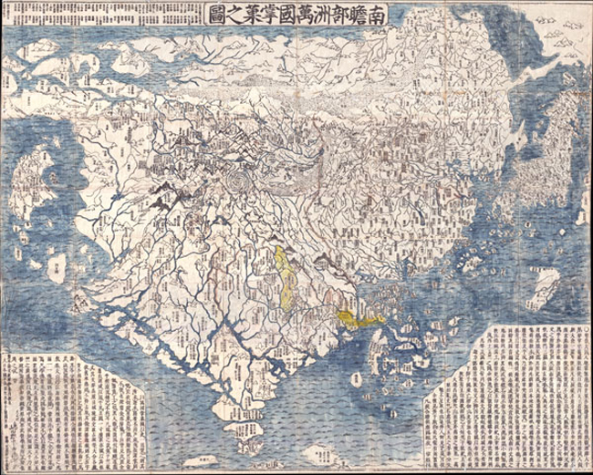
This new map, called “Nansenbushu bankoku Shoka no zu” is thought to be the first Japanese map to depict the rest of the world (outside of the three main Buddhist Countries at the time). Of course, you have to remember this is a Buddhist map, meaning things are mapped by religious significance (rather than actual accuracy), meaning India and China get a big portion of the map… most of it, in fact.
You can see India because of the peninsula at the bottom. China and Japan get a pretty big piece of the pie as well. In fact, this map is mostly made up of the three countries, so where is the rest of the world?
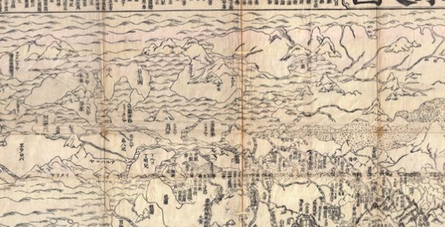
Europe is in the top left corner – as you can see, mostly just place names are written in – there’s nothing there of any (religious) importance, it’s just kind of up there, consisting of a bunch of islands. Countries like England, Holland, Hungary, Italy, France, and others are represented.
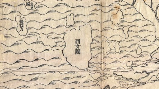
Supposedly Africa, this small island off to the West is labeled as the “Kingdom of Western Women.” Awesome.
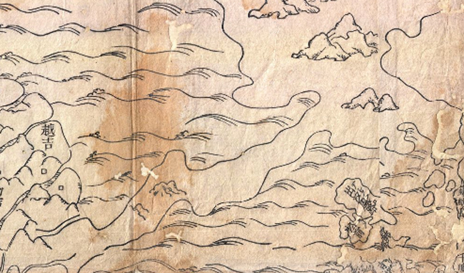
In the top right, it also seems as though they have Alaska and the Aelutian land bridge, which means even the Americas got some map cred. Obviously this is the most accurate part of the map – Alaska is still just a blank sheet of ice with mountains (just kidding people from Alaska).
I think this particular map is pretty awesome – it shows how the importance of certain things really can dictate how a map is drawn out. Obviously a big part is a lack of knowledge at the time of how other countries are laid out, but you can definitely see what’s important on this map (Buddhism) and what’s not (everything else). The scale of this map really wasn’t to scale in terms of land mass. Instead, it was to scale in terms of religious importance. I think India wins in this one. That’s where Buddha was born, after all.
Of course, maps like this couldn’t go on forever… not with Ricci’s maps making its rounds since the early 1600s. Eventually, someone made a world map for Japan that gained a lot of traction.
Nagakubo Sekisui’s Revised World Map
I think it’s fairly reasonable to assume that the copies of Ricci’s maps (which did make it to Japan) were some of the first good world maps that Japan had ever seen. Considering how closed off Japan was to the rest of the world at the time, a map of the world in a language that some Japanese people could read (at least better than English, or some other European language) must have been really interesting. Still, Ricci’s maps weren’t necessarily widely distributed, meaning the world was probably a mystery to a lot of people (though by this time people knew that other countries besides India, China, and Japan existed, of course).
Then along came Nagakubo Sekisui. He took Ricci’s map and copied it in woodblock print form. He didn’t just copy maps for a living (we’ll cover that in a sec), but I’d say he did a good job on this one. He made some revisions to the map, redrew it, and added katakana to his copy to make it more readable.
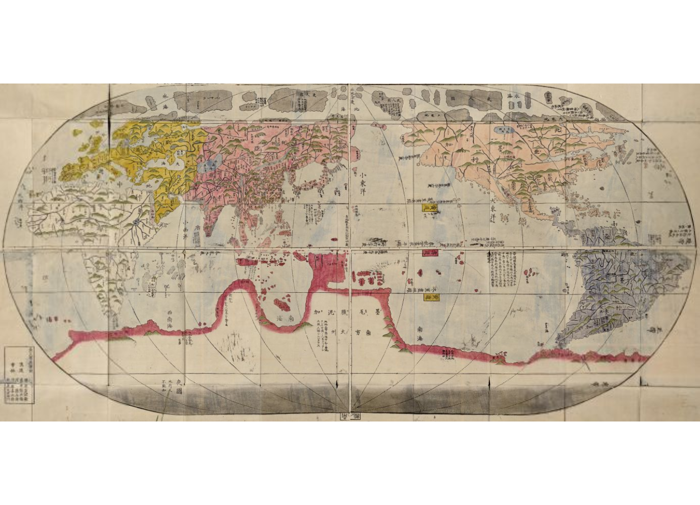
This map is known as the “Revised and Complete World Map” which supposedly came out in 1785. If you compare it to the original (Ricci’s) you can see there’s a bit more detail, especially in and around Asia. The main difference is the art style (definitely more Japanese/Asian) as well as the fact that it’s readable in Japanese, which is pretty cool.
Some interesting things about this map (as well as Ricci’s map):
- Florida is the “Land of flowers”
- The Sahara Desert seems to have a lot more water than I imagine it, at least
- “Sea of Japan” is omitted in this one, even though it’s in Ricci’s original
And I’m sure there are a ton of other interesting things in there, just waiting to be discovered. I’m guessing (someone will have to let me know) that a lot of the translations on this map come from Italian, which is a language I do not speak, though a lot of the katakana on this map definitely are close enough to the English versions where you can figure them out. イタリア is still イタリア, anyways.
The really interesting thing to me is that this is considered to be one of the first mainstream world maps in Japan. It was 1785 for goodness sakes! That’s almost 200 years after Ricci made his world maps, which were pretty darn good. I’m guessing this was mostly caused by how closed off Japan was from the rest of the world… but still, 1785 wasn’t that long ago if you think about it!
“Modern” Maps Of Japan
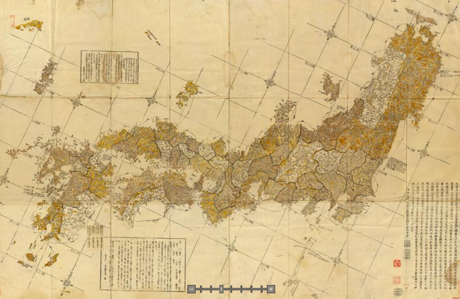
The guy who did the revised world map (Nagakubo Sekisui) also did some of the first “good” maps of Japan (he wasn’t only a copycat). He was the first Japanese map maker to use “geographical coordinates.” Seems like something you’d want to do, though I’m no map maker. As you can see in the map above, Hokkaido (Ezo, back then) was omitted from this map, apparently because this area wasn’t totally known yet. It’s Japanese frontier country, after all. You can find a lot of his works here, which are pretty nice, if you’re into that kind of thing (talking about maps, you sicko).
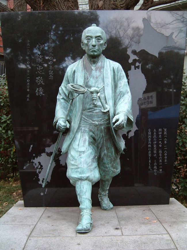
There was another (arguably much better) map-maker in town at around the same time, though, who’s name was Ino Tadataka, though he wasn’t as well known for quite a while (now he’s like the cartographer of Japanese history books). Tadataka was hired by the Shogun himself to make a map of Japan. He spent the last 17 years of his life working on this map (which sadly, he didn’t live to see finished). He supposedly spent 3,736 days taking measurements, traveling nearly 35,000 kilometers, working to finish a 1:216,000 map of the entire coastline of Japan. He died in 1818, but his team finished it 1821.
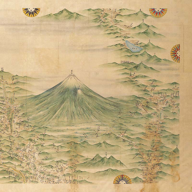
The maps by Nagakubo were widely distributed and used up until the 1860s, even though they weren’t as good as Ino’s. Ino’s maps were kept secret by the Shogun for a while, plus they came out much later (1821 versus 1785). Ino’s maps were of much higher quality, though (and quality is king, I’d say), and were used for much longer (as late as 1924) due to their incredible accuracy (much of it accurate to 1/1000 of a degree!). Ino also worked on maps of Hokkaido, as well. He even has a statue to commemorate his map making skillz.
Into The Future
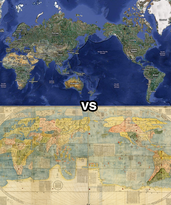
Of course, the future has brought us an unprecedented level of map accuracy. With satellite images, technology, yadda yadda, maps are pretty good. One of my favorite “new” map features is of course Google Street View. Not only can you see a top down view of Japan, but you can get right down into almost any street, and see a 360 degree picture of that particular part of that particular street. If someone told me you’ll be able to do that ten years ago, I’d probably have thought they were crazy.
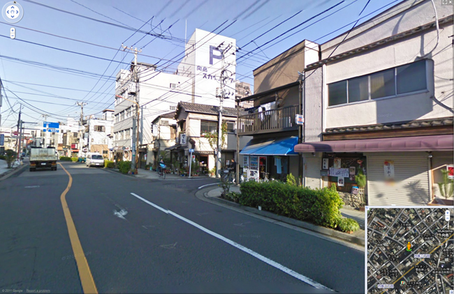
Makes me wonder, though – Did people back then think “this map is as good as it gets!” just like I’m doing with maps right now? I imagine there are some things that can be done, like 3D rendering of land height / etc., but what else is there to do? I suppose there’s a lot of crowdsourced options, where people add in tons of information about local spots, which would help people find more interesting things, but where do you go from there?
Anyways, as you can see, Japan has come a long way in terms of how they see the world and how they see themselves (from a map-perspective, anyways). I kind of miss the old style maps – they definitely were as artistic as they were useful (or just artistic, in some cases). Maps nowadays are way more useful, but they lack the same style and feeling that old maps had. I guess that’s because maps aren’t really hand drawn anymore. Those were the days, eh?
