I don't remember my first encounter with Hello Kitty. I have memories of being aware of her existence sometime in the late nineties, but there was no memorable first meeting. For me, Kitty-chan was neither here nor there. Until I moved to Japan.
While living in Japan, Hello Kitty was unavoidable. My fringe awareness became a full on, hyper-focused red alert of Hello Kitty presence. She was everywhere. And I mean everywhere like Christmas music the day after Halloween. She was on my student's pen cases, my co-worker's desk, my friend's shoes, jewelry, cups, refrigerator magnets, smocks, spoons, hats, cars, everything! I was suffocating in Kitty-chan. But the suffocating wouldn't have been so bad if everyone around me didn't love the suffocation so much.
Don't get me wrong, I don't begrudge a character just because it's popular. But with Hello Kitty I couldn't understand for the life of me why she was popular. And I had (at the time) two good reasons why she shouldn't be.
- Her design is too simple. White face, two dots, yellow nose. Boring! Great character designs like Bugs Bunny or Gundam Zaku have some complexity or originality to their form. They involve something substantial and imaginative you can hold onto.
- She's not from anything. We western-types like our vacuous media characters to have a source, like how Mario is from a video game and Spider-man is from a comic book. A lot of characters I like are paper thin in their depth of character but at least I can say, "I really like the cereal they're from!" But despite having nothing to hold onto, a lot of people, many of whom I respected as individuals, held onto Hello Kitty for dear life. So what was I missing? Let's address these gripes in order.
1. Her Design Is Too Simple
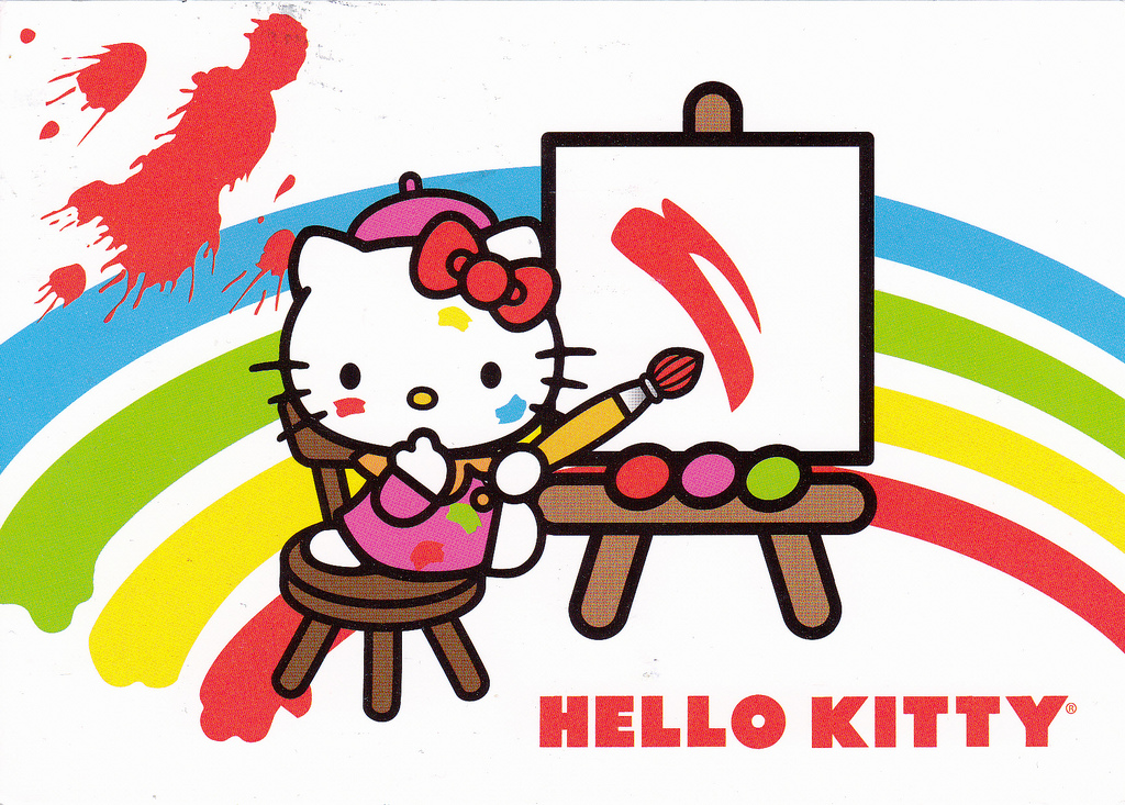
My first complaint was that Hello Kitty's design was too simple. And therein lies the problem, right? Unless you consider what draws us to cartoon characters in the first place. When you strip an image of its details (shading, texture, etc.) down to its essential elements, it becomes less specific. It is no longer a picture of one thing but a representation of that thing.
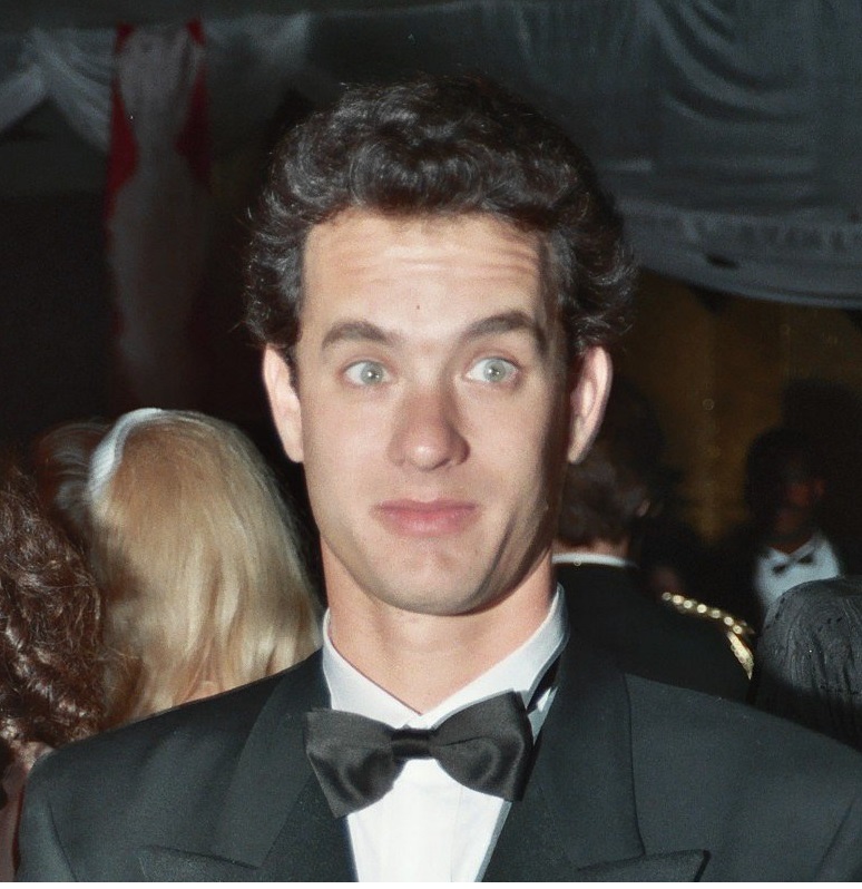
This is clearly a picture of Tom Hanks. He may be mistaken for someone else, but generally, most people will know this picture represents Tom Hanks.
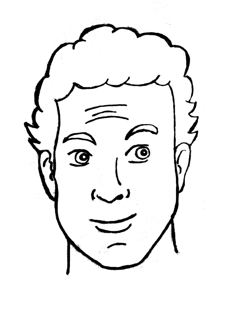
This still may be recognized as Tom Hanks, but if you look at it in a different way, maybe it looks like someone you work with. The realistic details have been stripped away and now the image may represent a wider range of types of people.
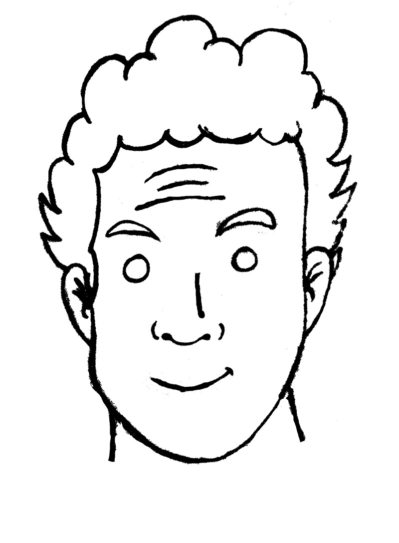
As we trim away the details, he becomes more ambiguous…
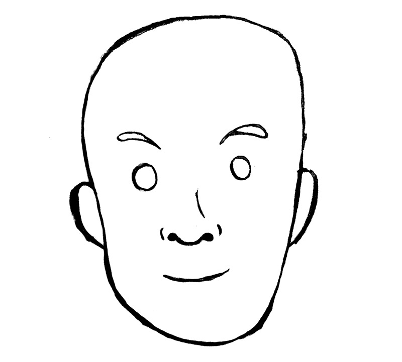
And more able to represent anyone.
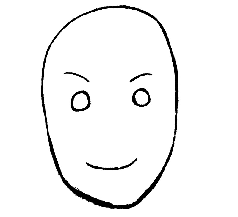
Now we are about as nonspecific as you can get. A few dots, some lines and a circle. This is incredibly simple and anyone can draw it. But whose face is being depicted? Is it male or female? Old or young? Without the artist giving details about whose face has been drawn, it is up to the viewer to decide what is being seen.
The less specific the image, the more power the viewer has to interpret it. What do you see when you look at Hello Kitty? She is a simplification of a cat, but what kind of attitude or style is she emitting? Visual storytelling guru, Scott McCloud, has this to say about the cartoon form, of which Hello Kitty is a part:
"The cartoon is a vacuum into which our identity and awareness are pulled, an empty shell that we inhabit which enables us to travel in another realm. We don't just observe the cartoon, we become it!"
More than likely, what you're seeing is you! What does Hello Kitty look like to you? Is she cute or sassy? Grown up or childish? Fun or chic? It mostly depends on who you are and what you want her to be. Her blankness draws you in and allows you to interpret her, and then wear or own her in the style you choose.
But in essence, all cartoons can do this. This interpretation of representation is vital to the cartoon form. So what makes Hello Kitty different?
A Game of Cat and Mouth
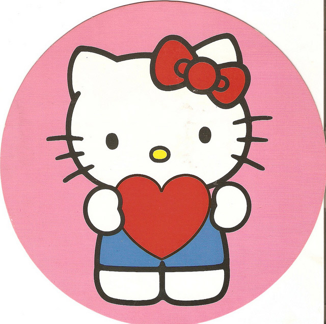
Hello Kitty's ability to be interpreted is taken one step further than, say, Betty Boop or Tintin. The advantage Kitty-chan holds is her lack of a mouth. The reason for this is summed up best by Yuko Yamaguchi, the current character designer (meaning "boss") of Hello Kitty:
"[She doesn't have a mouth] so that people who look at her can project their own feelings onto her face, because she has an expressionless face. Kitty looks happy when people are happy. She looks sad when they are sad. For this psychological reason, we thought she shouldn't be tied to any emotion – and that's why she doesn't have a mouth."
The power of Hello Kitty's interpretation now extends a layer deeper, beyond our idea of what she represents into our idea of what she is feeling. This gives her life in our minds, in a way that "mouthed" cartoons can't. What Mickey Mouse is feeling at any given moment, not counting his situation or environment, can be clearly seen through his mouth. Hello Kitty, lacking this feature, could be feeling anything at any time! And thus whatever we may be feeling can and probably does get transferred onto her face.
2. She's not from anything
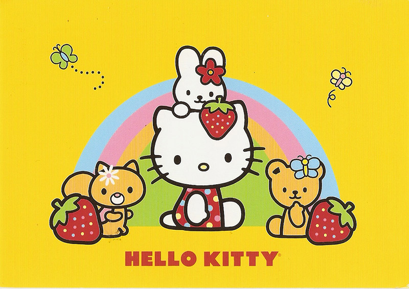
What about my second gripe, the one where I say that Hello Kitty comes from "nothing"? Well, that too is remedied by her inane face. The same way in which she absorbs the interpretations and feelings of her viewer, she also absorbs the surroundings of the designs she inhabits. Put her in a pink dress surrounded by hearts and butterflies, and oh! She is so adorable! Put her in black and white on a designer wallet and how retro chic she becomes! Oh, and put her in a Godzilla costume. She looks right at home there, too.
No matter where you put her that's where she belongs. And that's why she can't "be from" something. Her lack of definition works for her yet again. She's from "nowhere" and "everywhere" at the same time.
INTRODUCING! Mr. Rounded-Edge Rectangle Head Man!
So there it is! I have unlocked the secret to the multimillion dollar success of Hello Kitty. Coincidentally, I am proud to announce my new character, Mr. Rounded-Edge Rectangle Head Man!
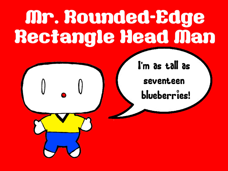
I'll be putting him on cycling gloves and fanny-packs, so get ready to mail me all your money!
No dice?
Oh wait, I forgot. There is another pair of creations by Sanrio that are not nearly as popular as Hello Kitty:
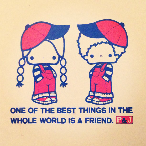
Patty and Jimmy! Despite being simplified and having no mouth, these two are hideous and unpopular. But they got the formula down, so what's the problem?
This Little Kitty Went to Market
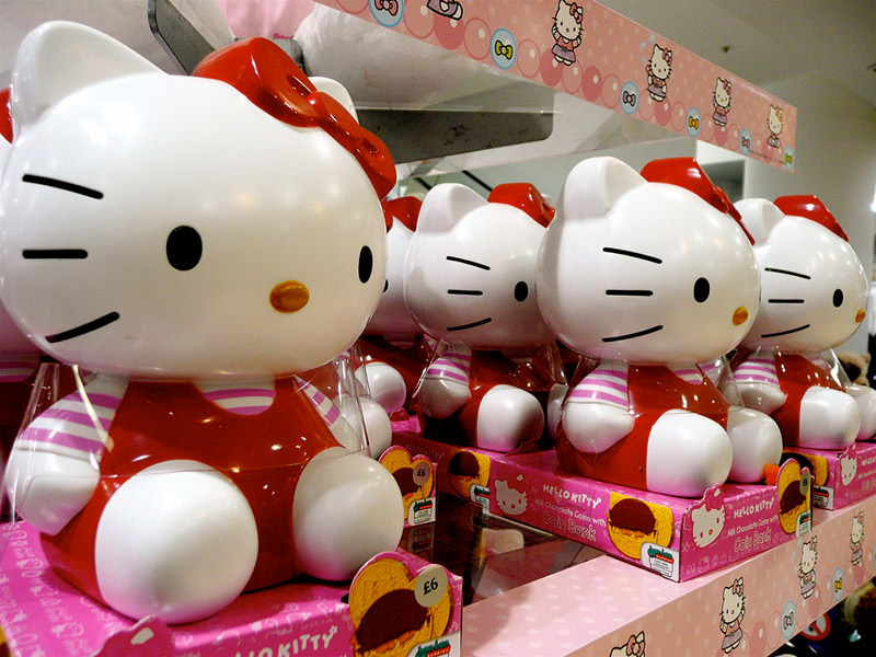
Kitty-chan's design, genius though it may be, was not enough to bring her billions right off the bat. Even though she had early success, there was a long process of good luck and good decision-making before she really started raking in the fanbucks.
Hello Kitty creator Yuko Shimizu was tasked with creating six characters for Sanrio in 1974. Among these was an unassuming white cat. Shimizu was keen enough to realize that simplicity was important for the characters she designed, but she didn't understand the impact of removing Hello Kitty's mouth.
"I couldn't express the mouth in a cute way, so I decided not to use it."
That was the genius move that set Kitty apart. A happy accident. The decision behind the defining feature of this iconic character was a lack of decision.
But Shimizu's indecision was fruitful and her character was immediately successful among young girls. In the beginning, Hello Kitty was only printed on small gifts like stationery and watches, usually sitting on a couch or cutely flying a bi-plane. The following fifteen or so years saw a steady decline in popularity for Kitty-chan. She remained a mildly popular children's commodity until the children began to grow up.
In 1994 Sanrio launched Hello Kitty's "Face Series" to extend her appeal to an older audience. Sanrio had spent twenty years selling Kitty goods to children and had begun to grasp the power of her meaningless face. The attachment of kids to this character was strong and it would be foolish to let that attachment weaken as they grew older. The "Face Series" was Sanrio's first attempt to market Hello Kitty products to teens and adults. Oh, and it worked. Big time. Biggly large time.
Sanrio continued its smartness in the early 2000s when it conducted research which concluded that one third of people shopping in the U.S. were over eighteen and shopping for themselves. Surprise! Five-year-olds have no money. This led to Kitty goods which encompassed more sophisticated items such as lingerie, guitars and designer watches.
At the present time, Hello Kitty has become empress of the merchandising world. Her malleable visage graces everything for everyone, from dollar bin tissue boxes to designer purses. She is bought by grown women with a sense for high fashion and young girls who "wike kitties." This cat's power is astounding.
The White Queen
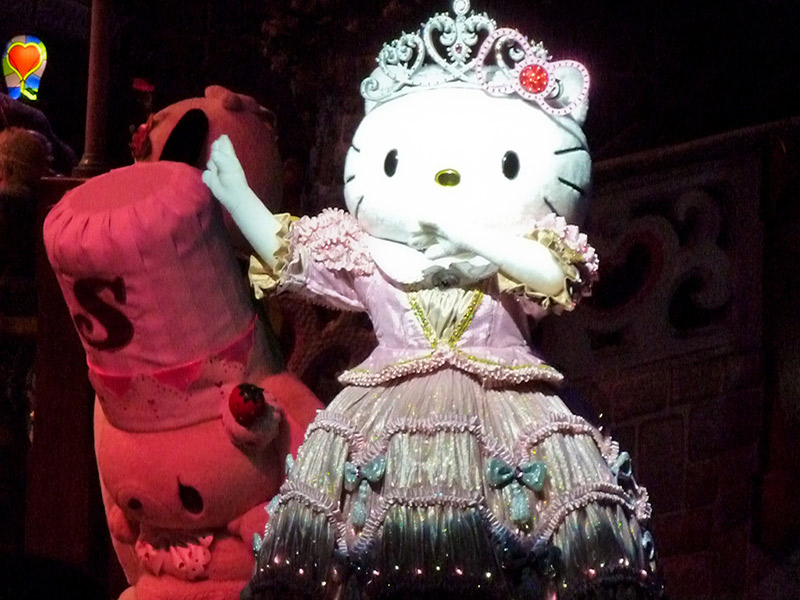
Do I still hate Hello Kitty? Not at all. I'm not a fan in the traditional sense, but I find the unintentional genius of her design and the business acumen with which she was put to use utterly fascinating. The power of the consumer to mentally project whatever meaning they want onto your product means you lose control of your product, but gain control of the consumer. You basically have the power to sell consumer's selves to themselves!
The concept of this kind of power inhabiting a modest white cat makes her seem so much more formidable. She has a great power to grant the comfort of her world built around one's own wishes, but with it maintains the control of all who love her. She is no mere mascot, but a queen! Not dark, but beautiful and terrible as the dawn! Treacherous as the sea! Stronger than the foundations of the earth! All shall love her, and despair!
Or perhaps that's just how I choose to interpret her.
